I want to share some old designs I worked on back in 2010.
Then I was designing a completely new type of UI based on fractality of everything, together with our company adHD Oy Finland, together with Jyri Hovila, Taina Peltola, Jani Salminen and Aki Tåg.
Our company didn’t really take off, but we did a lot of design and some simple prototypes. We had ambitious plans, but we didn’t get any further than the planning stage and implementing some simple UI prototypes.
Our idea was to build a Linux based operating system, that would have completely new UI paradigm. Jyri had the idea of the Linux based operating system, and I was thinking about the UI side.

We were pushing away from the notion of computers having to imitate books, or other traditional media, like tablets and phones were doing back then. Where is the real intelligence in that? Or smart as in smart phone ?
It only smarts to use, trying to replicate old world paradigms like pages, tabs, files etc in a modern environment. We don’t have to anymore limit ourselves to something traditional with new digital platforms, so why cling onto old ways to think ?
We could create something for the purpose from the ground up, that is optimized for that use case, but instead it seems many just try to imitate already known analogue user interfaces, transferring those into the digital world, which to me doesn’t make much sense, except from the point of having familiar terms to work with and bring people in.
But those files, folders and floppies and all user interfaces paradigms we have been so used to back in the day in the physical world, are now dead. I mean, who uses folders anymore ?
When was the last time you saw these? This used to be the universal icon for saving a document
They have went the way of the famous floppy disk as the save icon, young people don’t even know what a floppy disk is, and the same is with many UI paradigms we still stick to.
Fractal User Interface
Working together as a company, we had a problem, a problem all teams and companies have: how to share information efficiently? How to see at one glance how the project was doing and how the team was completing their tasks ? No current software we looked back then was able to provide that view, in a way that you could just see from a single page, a single glance, what was going on with your team and your project ?
I started wondering, why were so many team collaboration software (definitely back in 2010 at least) designed around the concept of books and pages and so on, that fit poorly in a web environment ?
Optimal situation would be to have an immediate visual overview of what is happening in your project, without having to go through different pages, tabs, issues and so on to see what is going on with the project. I wanted to have an immediate view onto how the project was doing, without having to dig any deeper in the UI.
I really wondered, why stick to old paradigm in the thinking of how things should be done ?

So I started to think outside the box, designing from the get go what would an intuitive user interface look like, for seeing how a project was doing. It would naturally be built around the people connected to a project, and people completing tasks for the common nominator in the center, the project, that everyone would be committing work for.

I was starting to imagine this as a tree, taking something from the nature and starting to build around that concept in my mind. A traditional list, or box based UI didn’t feel like a natural choice, so we began from the very simple roots (ha!) of what it is to build an user interface and what would feel natural for the user.
The main UI was based around the idea of building an UI based around one usage paradigm:
Everything is Fractal.
Here we can see an design based around that concept, designed for a discussion forum app. It would use a fractal tree node based interface for displaying data:

Design for a discussion forum app (click for full version)

Branch detail from discussions
The idea was that all data displayed in our UI would be based around fractal tree nodes, and that same structure would be repeated for different data all over the system. In the picture above, we show a design for a discussion forum, but this same model could be used for contacts, messages, files and all the data you have on your phone.


This would mean that only one set of UI paradigm would have to be designed, and that same UI model could be re-used all over. No more re-designing every part of the UI, just design one part really well and repeat that!
No more multiple types of menus, drop downs, windows, whatever you need in traditional UI to visualize data, but only one set of really well working interface that would be replicated all over the place.
Fractality of Usage Patterns
We wanted to go further with the fractality of the design, and not just represent it in the visuals of the system. We wanted the usage of the system to be fractal in nature.
This means, that you only have to learn a set of certain hand motions to do any action. And you could use these same actions in every context in the UI. This is sorely missing from modern UIs, where you have to constantly change your muscle actions, leading into not being able to program the muscle memory efficiently, not being able to learn and remember different parts of the UI instantly.
For example, when you learn a sport, or play a game, first you think about it, but the main goal is to be in a state of not thinking about the action being performed, just do it, flow with it.
With modern computer UIs, this is very difficult if you are not using the keyboard, as with mouse and other position based UI’s, you constantly have to keep your attention on the screen, and figure out what does what. This is not optimal for storing the actions into your muscle memory, as the actions are constantly moving into different places, and you cannot just forget about the context and perform similar actions without thinking.

Our UI was designed to be used primarly by hand motions, touch screens in mind back then. So that you would only have to learn a set of certain actions, and repeat those same actions in different contexts, all over the system.
This, I believe, would result in a UI where you can flow through the usage, without thinking about it too much.
Currently, for example, if I want to save this document, I have go through this thinking pattern:
- What key is used to save this document ? Okay, ctrl+s in this app. Press that.
- What if I don’t know or remember that key ?
- Look through the menus. File ? Document ? Okay, it’s under Document in this app.
- Go through the menus, that are always different for each app, so I have to move my focus into the menu and position my mouse exactly in the ‘Save’ position and click there.
- Look at a message from the app, was my document saved or not ? Where is the application telling me this ? Oh, in the upper right corner in this context. Ok.
So many specific and accurate actions needed for such a simple action, if you don’t remember the keyboard shortcut. And keyboard shortcuts are perfectly fine, but in a mobile phone or a tablet, you don’t have a hardware keyboard to rely on.
So I have to constantly keep my focus on a simple action I repeat maybe hundreds of times a day, switching from app to app, then figuring out again where to exactly position my mouse cursor or my finger, and how to do that.
Why cannot there be a single paradigm and action to take care of this ?
The main problem is the changing paradigm, and the fact that I have to focus on the action to perform pixel perfect movements. This takes away from the main focus of performing whatever you are doing in a creative flow. It all can break the flow, and move you away from the state of creativity to a state of bafflement and possibly even forgetting what I was doing at all currently.
Universal Controller
In the center of our UI would be this controller, termed Chakana -controller, as it was based on this Inca Cross formation, containing within it the Golden Ratio and Pi, modeled after the Chakana:


This cross came to me from a south american friend back then, and we studied it and found that it contains within the ratios at least for the Phi and the Pi, so in a way it was information stored in visual formation. In traditional South American culture this formation was the basis for many architecture, music, design etc, and they had the idea that each direction represents some basic element of life.
So we took this design, and applied the idea that you could control the UI with 4 different major directions, each direction representing an universal concept, like ground, air, fire, water and other universal concepts, and then seek out how those concepts would map onto when working with documents or when sharing contacts, or other actions depending on the context you were working on.


For example here you would see the chakana compass appear over a contact in your Today list, enabling you to share when selecting the upwards direction (Sharing, Air, Putting it out there, No-Time) modify when selecting down (Modify, Earth, physical action, the Now moment), see your call history (History, Past, Water) and also maybe see your future calendar contacts when selecting the right operation (Future, Fire).
Not all of these would of course map directly to these concepts, but we had the idea that if you remembered the general idea behind every major direction, you could then apply that to each operation in some sense, and you would always have an idea what direction you need to take in order to achieve some action that is related to that concept.


Here you can see some idea what these major directions could represent. The main idea was to map your muscle memory in a way to one direction, and then you could know what that specific direction does generally in different contexes.
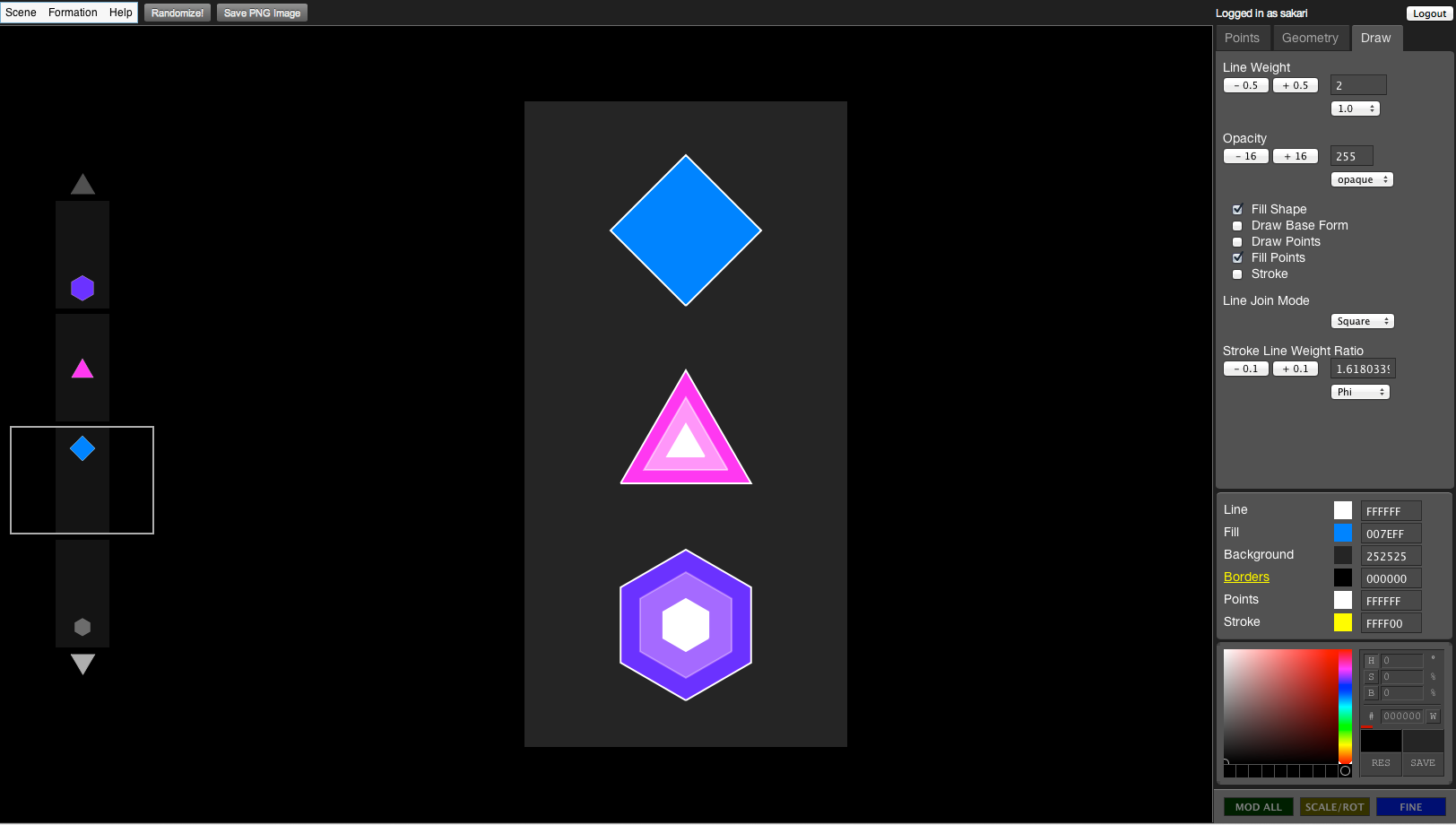
Resulting hopefully in a more natural user interface, where you don’t have to read and understand all the time what you are now operating on, but creating a flow state through the usage. We never got to the phase of testing this in action, except some prototypes I implemented later for GeoKone (now OmniGeometry), but which I never put into production yet.

Solu Computers Implementation
I was kinda happy to see that Solu Computers were working on a similar user interface later. I actually worked there in late 2016 for couple of weeks, so I got to work on their UI for a bit too, but it just wasn’t my place to be at the moment, although their solution implements this fractal idea pretty much as I had visioned back then. So, hopefully Solu will get their computer and UI out :)
Future plans
I still have plans to implement parts of this UI, maybe for OmniGeometry or Geometrify in the future. Hopefully I will find somebody to help me implement this, so this is also part of why I want to share this information, so I can show people some of our plans.
Anyway, this was enough of past plans made in 2010, hopefully soon I will be able to implement these designs :)
This was inDigiNeous, aka Sakari, signing off!